Role: Brand Partner / Creative Director & Copywriter
As a copy-based creative, my job isn't just writing copy. It's storytelling. And sometimes, it's the story behind the logo that makes the whole brand work. This is one of those times that the story is the logo is the brand. Want to know what I mean? Read on!
A rising fintech startup brand, Rate's essential brand promise was always to provide better value to their users.
However, the Rate team felt that some internal alignment and brand refocusing was necessary to bring their game to the next level.
And with 2 other product brands under the parent Rate brand with plans to launch more, the issue of brand alignment was crucial.


My team and I were tasked to help Rate create a visual identity that would make sense. So we started by dissecting the Rate brand, distilling it down to its essentials.
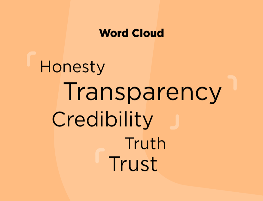
We quickly realised that for a brand to operate in the online payments/ecommerce space, brand credibility and consumer trust is paramount.
Our challenge was to express this sentiment visually, and in a way that would bring it all home for the Rate team.
The Answer? The true mark.
You may know it just as a simple check mark ✅, but it's a symbol imbued with literally thousands of years of meaning.
The ancient Romans used to check off items on their lists with the letter 'V' for 'Veritas', confirmation that the items were present in their stated amount.
And sometimes, ink wouldn't flow immediately, causing the left side of the 'v' to shorten. Over time, it evolved into the '✓' we know today.
That's why the check mark has another name. The True Mark.
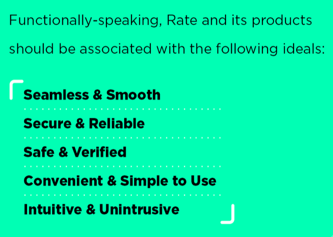
The True mark doesn't just denote Verification, Trust & Security. It's a mark that reminds the brand of its values.
We then expanded upon the usage of the system, demonstrating the breadth of possibilities through collateral design.
Thanks for reading. If you have any questions or a similar project that you need help with, feel free to drop me a message via the form below.
Thank you!