
Role: Brand Partner / Creative Director
Since their humble beginnings in 2008 as a recruitment agency, AYP Group has now grown to offer a comprehensive suite of HR and payroll services technologies for businesses worldwide. But with success also came an increase in competition. AYP approached us to re-evaluate their brand’s positioning to differentiate them from their competitors.
Setting AYP apart
To find out exactly how well AYP was doing in comparison to its competitors, we had to first do an in-depth brand audit. We conducted thorough investigations of AYP and its competitors’ digital assets and engagements, then assigned them each a brand score based on:
1. Brand Comms,
2. Visual Identity
3. User Journey
4. Perceived Brand Image
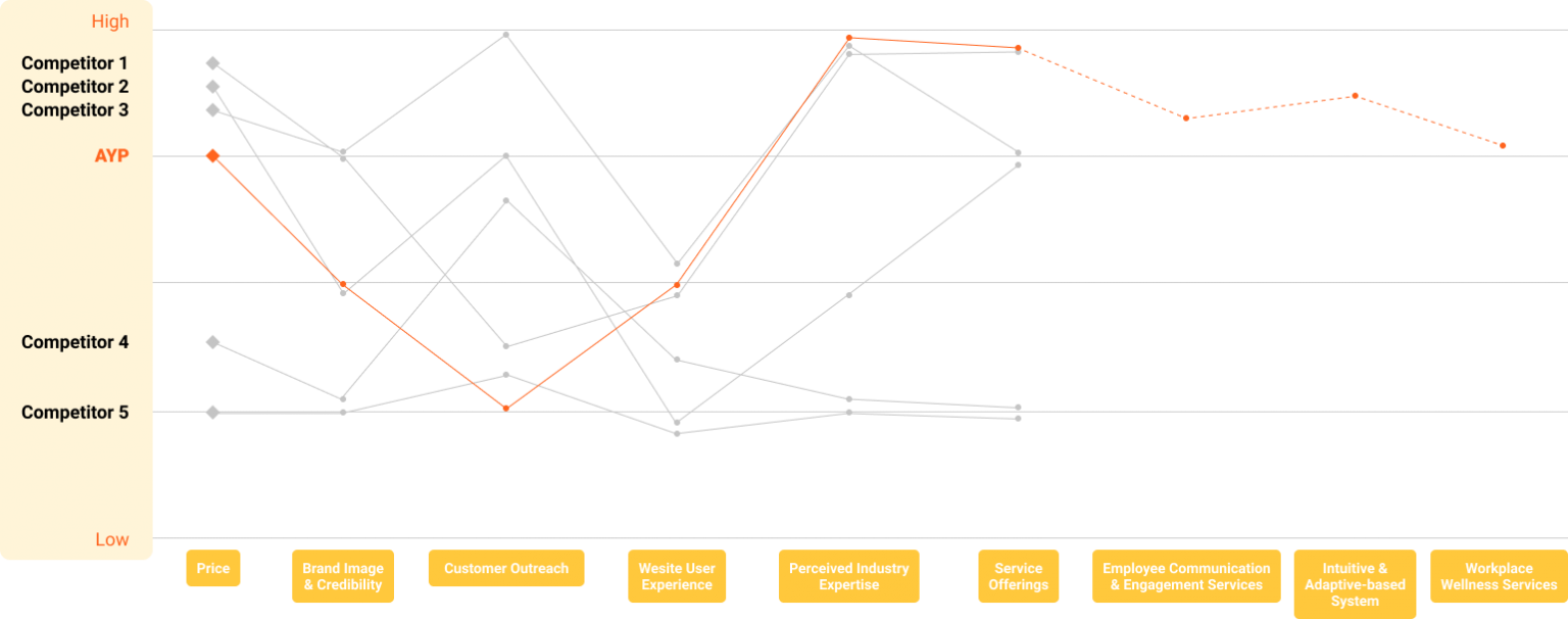
Besides refreshing the brand, our underlying goal was also to steer AYP towards a blue ocean of unsaturated market space. To do that, we plotted out AYP’s business propositions on a value curve map to help identify market niche opportunities.
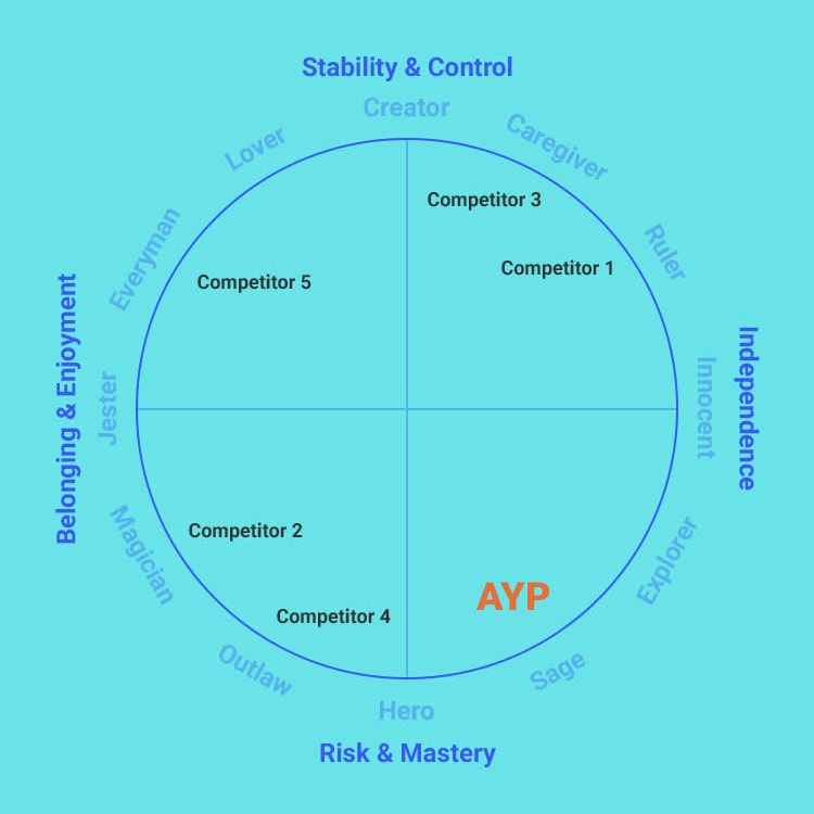
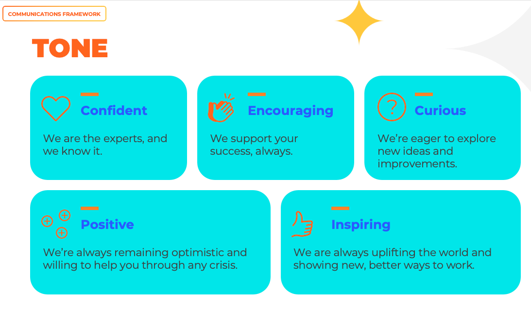
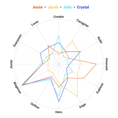
To amplify its presence and to build rapport with audiences, AYP needed its own unique brand voice and personality. So we put the AYP brand (and their key stakeholders) through our proprietary brand archetyping process (which I personally developed) and discovered something interesting.
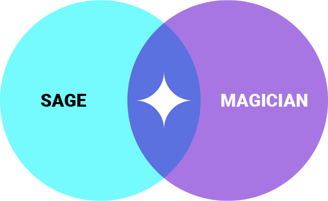
Dedicated to sharing its extensive experience and knowledge in the field on social media, AYP is clearly a Sage. Yet, the brand’s focus on developing tech-enabled solutions also signals its desire to deliver disruptive and transformative experiences, a typical Magician trait.
Seeing as how the two archetypes complemented each other so well within the brand, we decided to position AYP as a hybrid – a true Magician-Sage brand.
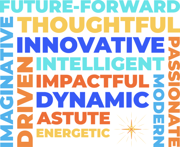
With such a perceptive and visionary personality, the brand needed a crisp new tagline to reflect AYP as pacesetters of the HR industry.
Always future facing and constantly innovating, AYP continually raises the bar for themselves, their clients, and the industry.

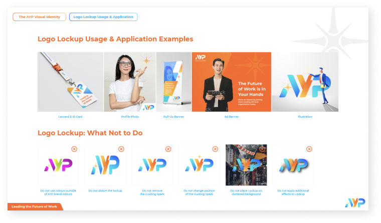
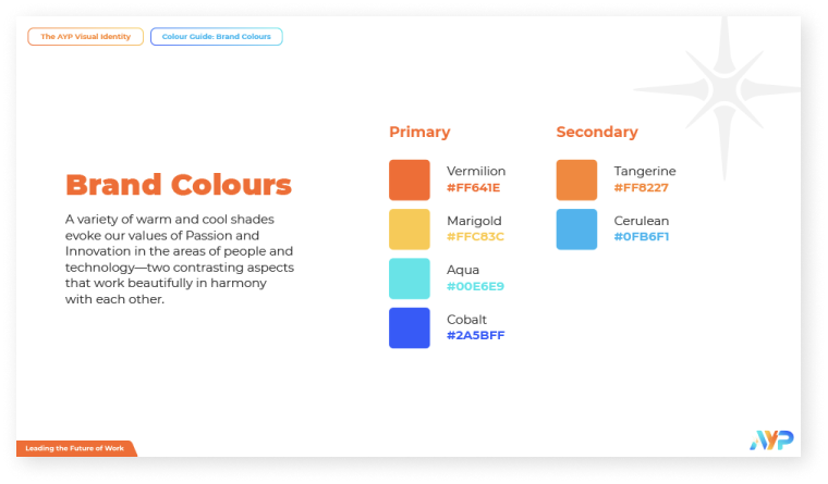
The hybrid archetype helped to guide not only their written communications, but also the creation of AYP’s visual identity. Just as colour and visual motifs affect emotion, AYP’s logo and brand colours were designed to align with its brand personality.
The Guiding Spark
The Guiding Spark is the evolved form of the original AYP Star. In its initial iteration, the Star symbolised brilliance and illumination. With the addition of the Compass points, it now also denotes guidance and navigation, no matter the storm or circumstance.

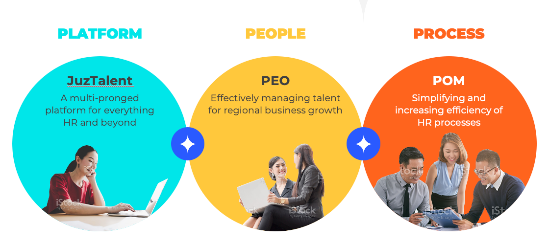
AYP Product Pillars
Part of communicating the AYP brand was also planning out its product pillars. This process streamlines the philosophies behind each product, creating a foundation for purposeful product-building and future innovation.
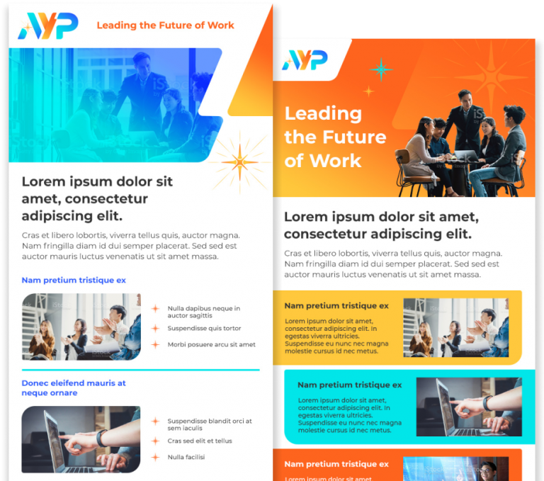
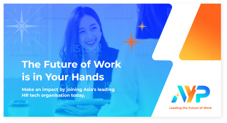
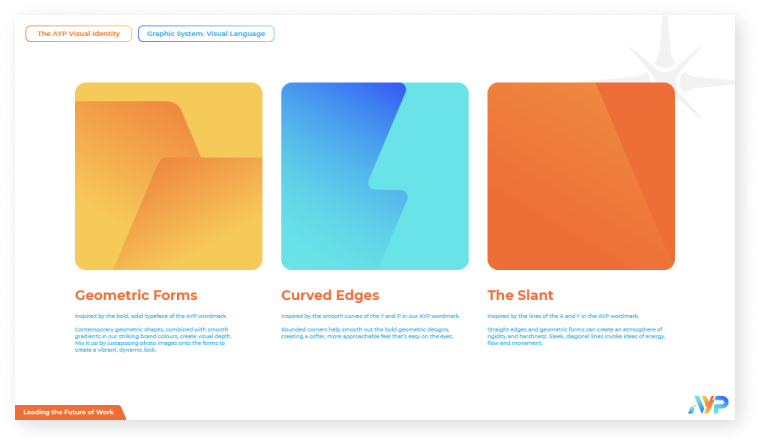
Brand Graphics Set
Redesigning the collaterals were also a huge part of this rebranding exercise to give the brand a move cohesive look.


Collaterals & EDM Templates
A brand guide was then compiled to help them stay consistent across all their communications.
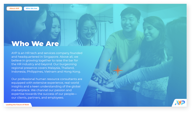
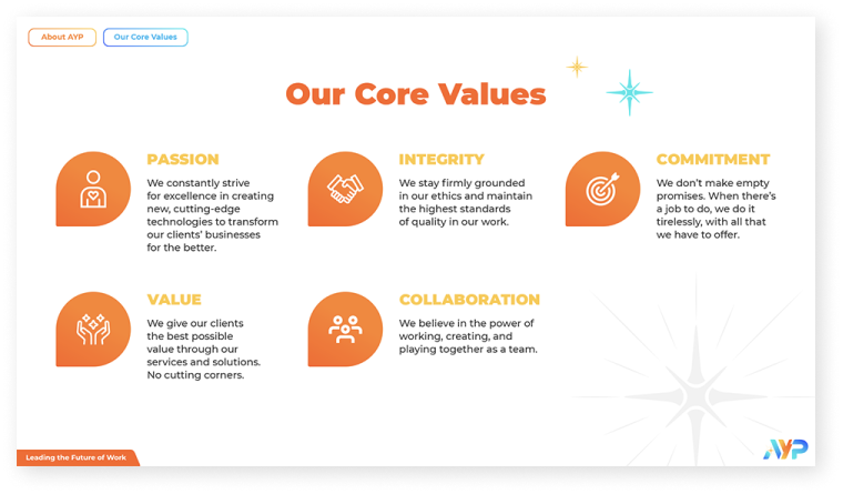
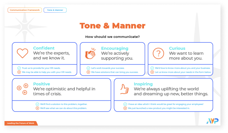
Selected excerpts from the AYP Brand Guide.
And because of the proprietary brand tool that I developed, we had an insight into the minds of the people who drove the business. From the results, we could see that everyone had a different idea of the brand in their minds. So we expanded our reach and spoke to more people involved with the brand –from stakeholders to employees to clients–and found that the view of the brand’s personality and culture was diverse.
So to realign AYPians to a common culture and identity, we crafted a manifesto to shape the AYP culture moving forward.
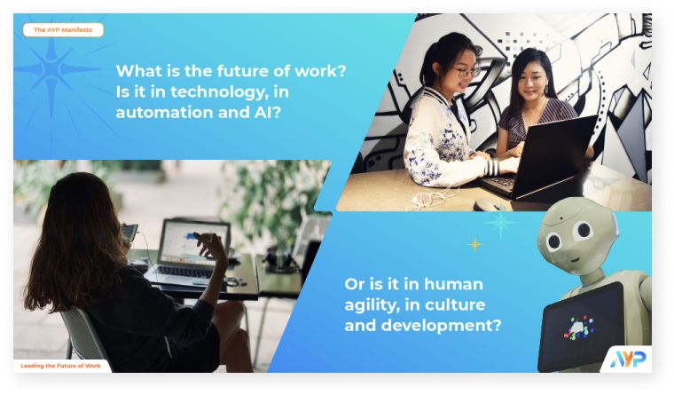
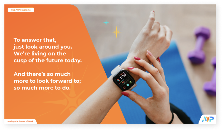
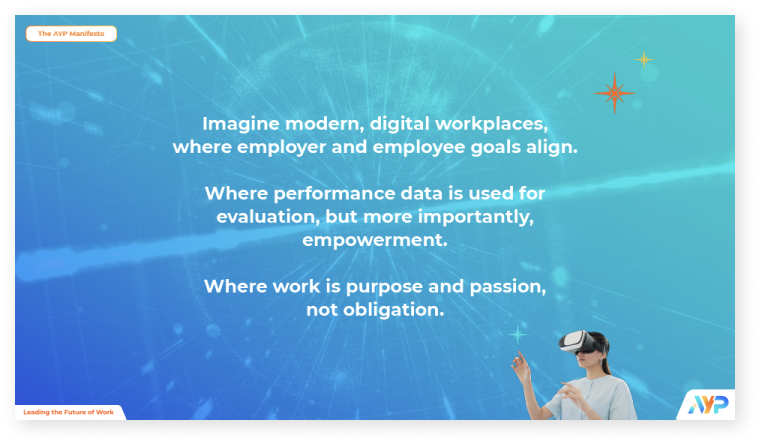
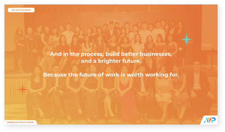
Selected excerpts from the AYP manifesto.
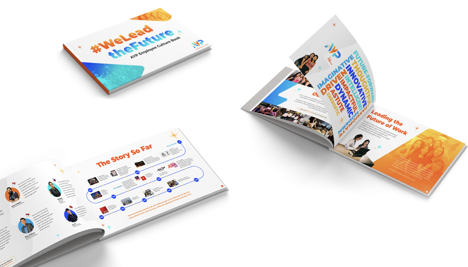
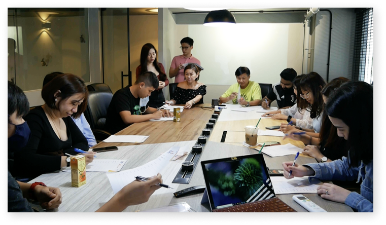
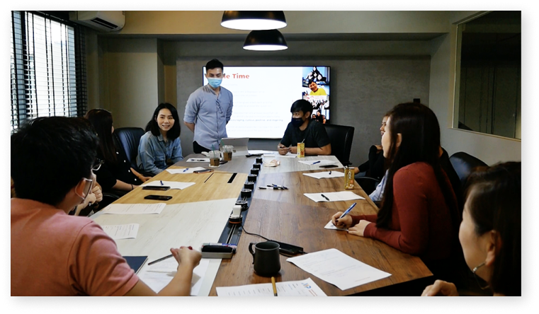
We then released a culture book, and followed up with a series of brand culture workshops. This was to align employee mindsets across the regional organisation and mark the beginning of this new chapter for AYP.


Thanks for reading. If you have any questions or a similar project that you need help with, feel free to drop me a message via the form below.
Thank you!